


 We just launched a universal layout that makes one-page tutorials even easier to read on-the-go: the same site is optimized for desktop computers, tablets, and smartphones (and looks absolutely gorgeous on 7-to-10-inch tablets like the iPad or Kindle Fire!) It is both fast-loading and goes easy on your plan's bandwidth limitations.
To experience it, check out (for example) our Notepad Tutorial in one of these tablets: on the 9.7-inch iPad, it truly feels like holding a desktop browser in your hand! This is the first time we've had that impression, and this experience is the best we've had for reference sites on a mobile device: let's hope you feel the same way - comment below otherwise! Here's a screenshot of the new layout on iPad: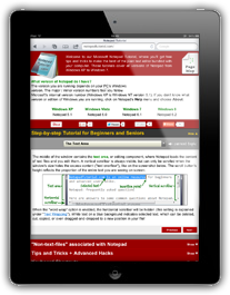
You now have a "Page Map", visible in the top right corner on the screenshot; it gives you one-click access to the entire document structure: think of it as a mini table of contents for a (long) page.
The still-somewhat-experimental "History" feature lets you navigate back and forth through sections and topics, just as you would on a regular website (we found ourselves trying to go back regularly, which went to another site in our browsing history!)